")
")
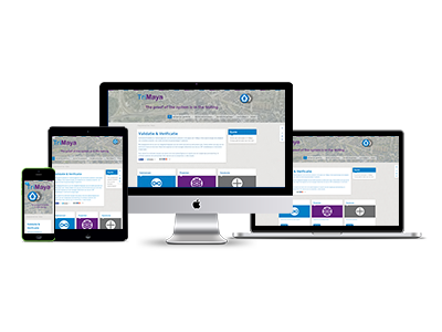 'Responsive Web design' is currently a widely used term, but what is it precisely? In this way of designing, it is taken into account that the website looks different on various devices and is user-friendly. Think of different formats like desktop, laptop, tablet and mobile phones.
Per device, Open Web Creations looks at how to classify the layout as optimally and user-friendly as possible. Each device has its own layout and scales with the dimensions of the device. Texts, images, and other content are scaled, also depending on tilting a tablet or mobile phone. You can also choose to display certain elements of your website on certain devices, or leave them out.
Because viewing websites on mobile devices such as tablets and phones is still increasing, it is advisable to design the website responsively.
Development and user friendliness
Designing and developing responsive web design costs more time. For each device separately, the website needs to be optimized and that is time consuming. However, the advantage is that you actually have 3 different websites, where the content of the website needs to be updated in only one place.